12 Valuable Lessons on Redesigns, Replatforming & Migrations
If you asked me 1000+ days ago if I thought I would consistently have some redesign, replatform, or migration on my to-do board I would have laughed. Not because redesigns make me laugh like Bill #Sebald stories, but because I “left” the design world for content and marketing back in 2011.
However, even though I may not classify myself as a designer today, I still get a lot of joy out of redesigns. They’re exciting but can easily become a nightmare if you are not extremely focused on the end goal.
I’ve talked to a number of peers over the years and found that redesigns are always a big challenge. Most had some negative experiences (and outrageous anecdotes). But site updates are a fact of life when your business is on the internet. That’s why we wanted to share some of our most important lessons learned.
Disclaimer: This is not a checklist
There are some truly incredible migration, redesign, and similar checklists out there, and I encourage you/your team to start your own. I’ll link to a few from my resource archive at the end of this post, and I’ll even throw in Greenlane’s tech-SEO list.
There is value in these checklists, but we know our work is more than following a list of items. The gold comes from what we discover via the IFTTT (if this, then that) approach. The lessons listed below are all the things we learned that couldn’t be captured in a checklist.
But First, What Do These Terms Mean?
Let’s take a step back and get to know the language because this is where it starts to get muddy. It’s very easy to use “redesign”, “replatform”, and “migration” interchangeably, but it’s not that simple.
It’s important to confirm that the terminology your team uses matches the scenario you have in mind. Otherwise, you could end up with wicked gaps in the estimated resources required and/or even worse, this could result in organic visibility getting crushed overnight. By default, some terms may encompass others. For example, a replatform generally includes some form of a visual redesign since you’re switching to a brand new software.
The most important differences to be aware of are:
Replatform – This is when the software delivering/managing the site is about to switch. URLs, user flow, navigation — just about everything tech-related will change. For easier situations, we’re talking about ditching something terrible for WordPress or a similar content management system (CMS). In more complex scenarios, you could be looking at switching from/to Magento, angularjs, and/or some proprietary setup.
Redesign – This is when we update the visual appearance of a website. URLs, user flow, and navigation can change or remain the same. This can be the least intensive option since you’re not necessarily changing every single thing like a replatform. There’s less relearning for crawlers to do in cases where URLs/navigation remain the same. This goes by a lot of names – site refresh, facelift, reskin, etc.
Migration – There are a few different types of migrations, so it’s important that everyone knows what exactly is migrating because lots of things migrate – geese, the Belted Kingfisher, URLs, and more. I encourage you to present a simple one-sheeter that breaks it down so everyone, in-house and external support alike, is on the same page. Examples of what migration can be used to reference include:
- URLs (from moving to a brand new domain or changing to https)
- Hosting packages and/or providers
- Platform migration (see “Replatforming”)
In addition to knowing when to use these terms, there are other important considerations:
What is the size, complexity, and intent of the organization?
Removing all the tech stuff, understanding operations and business objectives can go a long way. Just think about the differences between a large (or small) e-commerce site versus a doctor’s office with a dozen locations.
What is your level of involvement?
Team members balance a number of roles (no different at Greenlane). It is important to stay clear on expectations and areas of focus.
Are there staging/dev environments?
Get out ahead of this question by understanding how many dev environments there are, how they work together, and what it will take to get access outside of HQ.
1. Start as early as you can
When it comes to big site changes, Google recommends you do it piece by piece and not at once. But we know that can never happen. When a new site is needed, it isn’t slowly rolled into existence. It is built to launch on a given day. It is like throwing a large rock in the pond. For this reason, there is almost always some kind of visibility or traffic impact. This is just the way it is, and we have to accept that.
But starting early can help you get ahead of extra post-migration work. “Fix-it SEO”, where you’re called in after the fact, is the worst kind. From the first to the most recent project, we’ve pushed to get involved earlier and earlier in the planning process for any type of site overhaul. You’ll also want to know what’s being expected from your team. For Greenlane, we have a variety of team members that could get brought in to fill gaps when needed – analytics, content, UX, etc.
In a Moz article, Bill wrote back in 2014 about finding the perfect client, he included a question about internal teams that offers a spot-on match here:
Who will you be working with? What skill sets? Will you be able to sit at the table with other vendors too? If you’re being hired to fill in the gaps, make sure you have the skills to do so.
2. Ask a lot of questions
You can never be too sure. Part of the reason to call upon your entire team is to cover every angle possible. This process isn’t only happening in an SEO bubble. It’s important to ask questions and get answers throughout the process so the bigger picture isn’t lost. There’s no time like the present, so figure out the best means for an ongoing Q&A (Basecamp, Google Doc/Sheet, etc.).
Let’s take content for example. Maddie, Greenlane’s Content Specialist, has shared loads of insight as we’ve discussed redesigns.
What stuck with me most are the questions she asks while auditing content. The shortlist resembles something like:
- What’s the site currently doing?
- What do we want it to be doing?
- What’s the audience saying (surveys, user testing, customer service insight, etc.)?
- What are the gaps?
- What’s the action plan for fixing/post-launch?
3. QA comes with the territory
Get familiar with what it means to QA, how sprints work, and project managing in a dev world. Not a redesign has gone by where there wasn’t:
- Tech recommendation to split into multiple tasks
- Something missed in the release that took a follow-up sprint
When the site goes live your work isn’t done. That’s when it’s critical to switch gears to QA support.
Pro Tip: Speaking of sprints, if you aren’t using one already, implement a post-sprint checklist a few sprint releases ahead of a big redesign/replatform. This will lay the required workflow foundation for redesign review (and educate the client/decision-makers on this often missing piece).
4. Impeccable research or bust
Alongside the checklist items are topics that require special consideration, the IFTTT stuff. Since most site changes last at least 18 – 24 months, it’s important to make sure every recommendation is rooted in research.
Never build your site in a bubble based purely off of internal/vendor assumptions. It’s too easy to get it wrong. Here are 5 ways to do it:
- Heatmap and ask questions to non-converting users with tools like Hotjar
- Test templates and A/B test your assumptions outright. (Consider a partial launch of a template or element from the pending redesign)
- Mine your analytics account (conversions, user flow, etc.)
- Survey past customers and those that have converted
- Use Treejack or other tools to label navigation elements clearly
If there is one sleeping giant, it’s your architecture and internal link structure. Below is an example of what can happen when you take primary search landing pages out of the navigational hierarchy, essentially creating orphan pages:
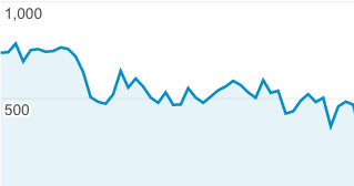
Introducing a new architecture and prioritizing/deprioritizing pages can erase months of forwarding progress.
For a recent brand consolidation project, we gathered information and presented a handful of options, two of which were the most ideal. We couldn’t take it down to the single best decision without the client’s input. The data stays the same, but their input provided the final nudge:
- Which brands/areas are most important (and by how much)?
- Risk tolerance vs status quo?
- What do users coming to page X, Y, Z expect?
Remember to present this information well – source your research, make it easy to consume, provide background, etc. This document will likely get passed around internally on the client-side.
5. There is no solo path/user flow
Speaking of impeccable research — don’t listen to any design house that focuses on a single user path/flow. That’s 100% fake news.
The truth is that I still blackout rage when I think about this, so Krista (Greenlane’s Director of Analytics) had to help me here:
“There is no solo user path just like there is no one user type for any website. The thought of a single user path is immediately flawed by even the most basic segmentation, such as a new versus returning user. I mean, unless you never want anyone to come back to your site since they may use it differently.”
6. Benchmark and crawl all the [meaningful] things
This point is every checklist’s darling, but I added it here because this point cannot be stressed enough. Begin identifying, prioritizing, and discussing when to begin gathering data (e.g. weekly site speed checks) for benchmarking purposes. This is very much at the intersection of technical, speed, and analytics/tracking.
The real lesson here is to be intentional with the data you gather. Sure, you can benchmark and crawl all of the things, but remember that it has to be meaningful. Need a few ideas to kickstart your list? Sean (Director of Tech) had these must-do points to consider:
- If any URLs will change, build-out redirects before launch. List out all old URLs and match ones that will change or be removed to equivalent pages on the new site.
- Test page speed before launch, and retest after launch. Compare speeds and make sure the new site is at least as fast as the old.
- Test staging environment with a crawl to make sure no infinite loops from parameters, meta hrefs, etc. exist.
- Check rankings report from SEMrush, and make sure important pages will have the same or similar text content after launch, in addition to any needed redirects.
I’d also add that finding historical crawls, audits, and/or site architectures is one of the best ways to help future-you. Platforms and URL change often re-reveal historical kinks in the chain.
And don’t forget to ensure basic tracking remains intact. This can get lost in the excitement of launch. Review in staging/dev and once again immediately following the push live. Sometimes it can be a challenge to ensure the standard code snippets have been transferred and are correct.
7. Don’t be too high level
What do you do when you have to convey a complicated concept to a dozen folks, half of which are hearing about it for the first time? You of course: “Give ‘em the high level.”
The challenge is that the majority of the conversations that happen with big-ticket changes include a variety of people, teams, and departments. This need to leave no one behind makes it very easy to only deliver mass appeal messages. Here are a few tips:
- Identify the best way to dig in. Consider separate calls to smaller teams and/or focused calls where the goal is to only address three or less big topics.
- High level ≠ watered down. I repeat, don’t water down recommendations. A botched redesign comes back on an uphill battle, especially if you plan on sticking with your partner for a while.
- Be as detailed as possible without losing sight of the bigger picture and bandwidth limitations.
8. Every redesign timeline is wrong
Let me rephrase – the first timeline you get is always wrong. Everyone is still just trying to figure it all out. And this isn’t any different than any other industry/career – timelines have and always will be a huge challenge project managers and “doers” face, but it’s painstakingly obvious with redesigns. Why? Because the majority of digital operations fizzle. It is easy to fall into the trap of making no or little progress because everything is judged against whether or not it should be “addressed after the redesign.”
As an auxiliary service provider to “the big redesign”, you should care for a few reasons:
- Disrupting Peak – All industries have some peak periods through the year or at least time blocks you’d call non-peak. See what I’m going for here? Do your best to guide timelines away from your bread and butter. Be the realistic voice with a plan, and move things along as best you can.
- Bandwidth Planning – Looking back at a couple of years of agendas, time tracker reports, and memories, the tasks associated with the site switch come in waves. This feast or famine can best be addressed by getting a “surge” plan in place along with identifying a non-core action item list.
- Temporarily Obsolete – Things dragging on beyond your control is a real shame. Don’t get me wrong, there are times when pausing is the best play. But pausing everything on your end is often just the easy choice. Instead, leverage the lull:
- Incomplete projects
- Housekeeping
- Test on the existing site because “it’s just going to be taken down anyway”
- Emotional triggers
- Page layout
- Long-form content
- CTAs
- Pitch something big and exciting
- Life after the redesign
9. Educate, educate, educate
The biggest truth to understand working in an agency is that we only interact with partners for a fraction of their workweek and priority list. It doesn’t matter how integrated you are. Take a look at simple math:
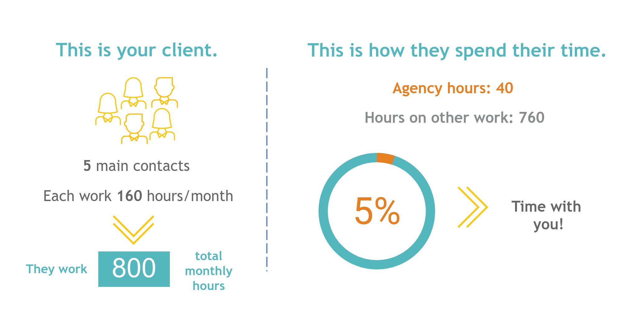
There should/will be more than just SEO that contributes to important decisions. This means your messages have to be easily heard among the noise, but more importantly, your primary contacts will have to carry the loudspeaker.
Education is key. Identify gaps in knowledge and mission-critical considerations that are going to require discussion. Schedule discussions, share links, write POVs, and/or share your screen for a live Q&A. Do what it takes to empower your partner to own it with or without you there.
10. Shiny object syndrome is real
So so so so real. I’m never dismissive since new technology and wishlist discussions often lead to great outcomes, but it’s important to remain on task. Develop your own pre-research process with questions to help you identify whether a topic is worth pursuing further or should be shot down. Some questions to consider:
- What is the real why behind this ask?
- What thought/research has gone into this so far?
- Do links, industry listening, and search support it?
- How much effort goes into this on all sides?
- What’s the estimated impact (and how could we measure it)?
The best partners will pick up on the process (see: educate, educate, educate) so they can begin defusing bombs as well.
11. It’s not over when it’s over
Womp womp, sorry to burst your bubble. This is when we keep our sleeves rolled up, as a large portion of Greenlane’s effort begins after the release.
If you’re working with an external vendor for the project, this is often their cue to transition governance. Whether internal/external, this is usually the cue for IT/dev to get involved with the QA.
Between transition flux and reviewing pretty much everything you reviewed prior to launch and in dev/staging, this will be a feast time for areas requiring attention. It’s worth saying again – make sure tracking and other codes (like testing/heat-mapping) remain intact.
Links and Downloads
Beyond the lessons learned above, consider bookmarking the checklist links below to help with building your own master checklist. All of these lists have shaped how I approach redesigns, replatforms, and the like.
A special shoutout and thanks to the sites/authors behind each. While not specific to site changes, Annie Cushing’s technical audit checklist is a must if you don’t have this box ticked. In addition to the new site, it’s always wise to conduct a technical audit of your current build to understand the strengths/weaknesses/opportunities (early in the process is even better).
Bonus #12: Don’t Stop Believing Making It Better
The entire Greenlane team rallies behind a phrase/idea: “Make it better.” It’s crucial to have that mindset during a redesign. Looking beyond making a better end product, embody this motto for the entire process. There are so many steps that could be made better, this time and the next.
Because whether you work agency (sooner) or in-house (later), there will be a next time. We’ve had some partners long enough to have been through second and third replatforms/redesigns. And we’ve seen first hand just how important it has been to archive past information for easy access.

It’s always a win when you can call back on your notes, even if you do have a typo in the email 😉
—
Well, there we have it. Are there any other lessons you would add? I encourage everyone reading to contribute via Twitter, or email (jon@greenlanemarketing.com).


