Don’t Make These Ridiculously Simple Mobile SEO Mistakes
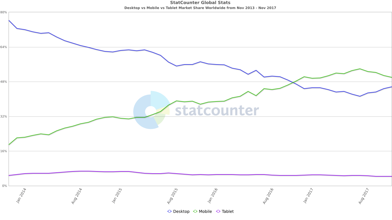
Unless you’ve been dialing up to the internet on a 56K modem attached to your Tangerine iBook G3, chances are you’ve heard that mobile internet usage has surpassed desktop usage for over a year now. Mobile SEO and the mobile experience is perhaps the most important consideration for your site after the content itself.
 Source: StatCounter Global Stats – Platform Comparison Market Share
It’s so important, in fact, that Google announced last year that they will be indexing all content by how it performs on mobile devices, and calling it “Mobile-first Indexing”. In the very near future, it won’t matter how good your content is if your site doesn’t work on mobile devices.
So your site works best on desktop, does it?
This issue is pretty uncommon these days, because thankfully developers haven’t been ignoring the rise of mobile. Today, most major platforms support responsive design, where the interface and content automatically scale to your screen size, using CSS.
Well-crafted responsive designs: The way of the modern web
 Even if you are using the beautiful Tangerine iBook G3, you definitely are experiencing the wonders of responsive design. That computer’s resolution is 800×600, which is way less than a modern smartphone’s resolution and well low enough to trigger the mobile version of most responsive websites.
Developers set breakpoints in CSS that trigger different sets of design rules based on screen sizes, such as replacing the desktop menu navigation with a collapsible “hamburger” mobile menu and resizing content width and font size for easier reading.
Things you should look for:
- All pages work on your phone
- Way too tiny text or buttons
- Missing elements, like navigation
- Landscape still shows the mobile view (phones are BIG these days!)
Google really wants you to do this
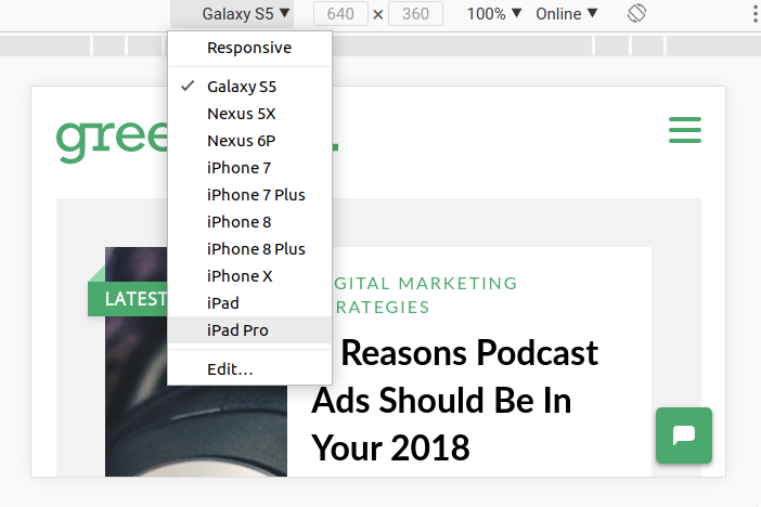
They’ve gone out of their way to help you out with mobile, including baking testing tools right into the Chrome browser you’re probably using right now! Google Lighthouse, previously an add-on extension for Chrome, is now built into the developer tools. In addition, you can use the developer tools to simulate exactly how your pages look on a variety of mobile devices. In the Chrome menu (the three dots to the right of the address bar), just go to More Tools -> Developer Tools.

And don’t forget – test this on your own phone! Checking out a simulated mobile view is great, but I’ve found tons of issues by simply putting finger to phone and seeing if I could break it.
Still procrastinating on HTTPS?
It’s rare to see a site that isn’t on HTTPS these days, as internet security is one of the biggest topics today. This is extra important for mobile SEO, as search engines know that poor quality and malicious pages could bog down or even hijack mobile browsers. Google’s stance is clear:
You should always protect all of your websites with HTTPS, even if they don’t handle sensitive communications. Aside from providing critical security and data integrity for both your websites and your users’ personal information, HTTPS is a requirement for many new browser features, particularly those required for progressive web apps.
Google really cares about this, so much so that it’s a pass/fail test in their Lighthouse audit tool. It’s also a really quick and inexpensive win – SSL certificates can cost as little as $17/year, and some hosting providers even provide them to current customers for free.
Things to look out for
If you’ve got SSL up and running, great! There can still be a few pitfalls that you should run through your site and check for, including:
- Not all pages show HTTPS
- Pages that show broken HTTPS (mixed content, signified with a little broken lock icon)
- Both HTTP and HTTPS render the page (HTTP should instead redirect to HTTPS)
Your images are WAY TOO ENORMOUS
It’s really great that you’ve taken nice, high-resolution professional photography for your site. However, have you checked how big those images are on the page? Are they uploaded at an enormous resolution, and scaled down in HTML? If so, you’re wasting a huge amount of unnecessary download time, killing your users’ mobile experience, and ruining your mobile SEO. These images take forever to load on cellular connections, and the much more limited resources of mobile devices may struggle to scale and display these.
Scale your images
I’ve seen sites with images downloaded on the page at such a high resolution, one visit to that page per day would be enough to burn through a normal mobile data plan! Your images should be uploaded at 2x their largest intended display size, which will ensure they look great on high-resolution mobile displays while keeping the size reasonable.
Use lossless compression
 If you’ve never heard of this before, that’s OK. Lossless compression is a magical process that removes all extraneous data from an image that isn’t required to display the image. Lossless compression can cut your image size often by more than half.
It’s so magical, in fact, that the most common library for doing so is called Image Magick. If you’re using a web platform, chances are this library is baked in, and might be one toggle button away from seriously speeding up your site.
If you want to test for lossless image compression on your site, a great tool is GT Metrix. Not only will it show you how much each image will save, but it actually performs the lossless compression and lets you download each resulting image!
“This page feels like it takes forever!”
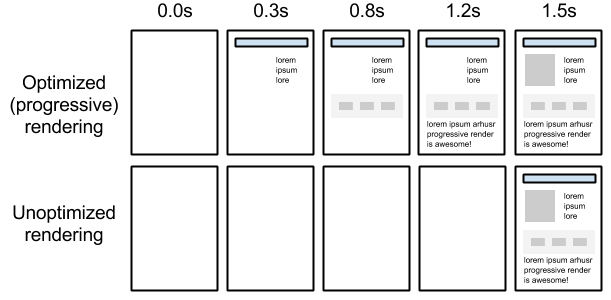
The most important thing to your mobile visitors is how fast the page feels. Even if your page has 100 gigantic images and takes forever to download, you can make it feel really fast by making sure that the “above the fold” content loads and renders as quickly as possible. Google refers to this as prioritizing the first meaningful paint, and it’s something their crawlers definitely put a lot of value in.

There are a few really simple steps you can take to supercharge your initial visible content:
- Put your CSS in the head
- Use super-simple media types and queries to make your CSS not render-blocking
- Move your JavaScript includes down on the page, and use the async property.
Why can’t I zoom in? I can’t read this!
Accessibility is a big issue for Google these days, and rightly so. The whole point of mobile-first is to ensure that as many people as possible can use your content on as many devices as possible. It’s easy to fall into the trap of seeing your site look good on your big fancy shiny phone, while it may not work on someone else’s aging iPhone 4.
There’s a few things you should look out for, specifically:
- You can pinch to zoom, even if the page is responsive and already sized to your device
- All text is readable, even captions and footer text
- All of the images have scaled well
- None of the items are overlapping in a weird way
- Things are easy to touch and navigate through (tap targets)
Take the “reasonable person playing with their phone while waiting somewhere” challenge
Also known as the RPPWTPWWS challenge, this important test is the very first thing I do when auditing a mobile site. Before opening any tool, it’s important to take out your own device, and try to use the site. Look for things that are “off”, are annoying, don’t work quite right, etc. Basically, anything that would bother you if you were trying to quickly use the site on your phone while you were waiting in like at the supermarket or something. Remember – you’re fighting text messages and pictures of cats, so make your experience as friendly as possible!
- Have questions about SEO for mobile? Contact us. We are recognized as a Top Digital Marketing Company on DesignRush.


